Sharp RPM
Continuing Belle IT’s mission to provide clinics with tools for effective remote patient assistance and monitoring.

The COVID-19 pandemic presented numerous challenges to primary care clinics globally, one of which was ensuring that patients could accurately and consistently record their vital signs at home. This issue arose due to the necessity for remote consultations and the limited ability of patients to visit clinics in person. Here’s a detailed look at this challenge and some strategies to address it:
Challenges Faced by Primary Care Clinics
- Accuracy of Data:
Patients often lacked the training to correctly use medical devices such as blood pressure monitors, thermometers, glucometers, and pulse oximeters. Incorrect usage led to inaccurate readings, which could mislead healthcare providers.
- Consistency in Documentation:
Patients might forget to record their vitals or do so irregularly, leading to gaps in the data. Handwritten records could be prone to errors, illegible handwriting, or loss of data.
- Technological Barriers:
Not all patients had access to or familiarity with digital tools or platforms for recording and sharing health data. There were variations in the quality and reliability of home medical devices and platforms.
- Communication Issues:
Ensuring patients understood how and when to take their vitals required clear communication, which was sometimes challenging through remote means.

The Proposal
Introducing Sharp RPM by Belle IT, a cutting-edge mobile application that utilizes computer vision to accurately translate device readings and consistently send them to a web-based portal for medical providers. Sharp RPM enables providers to monitor patient vitals and receive automated alerts via smartphones. This innovative solution transforms the vital recording process from reactive to proactive, significantly enhancing patient care. Sharp RPM sets a new standard for future projects at Belle IT by leveraging computer vision/AI technology. This technology automates the identification and measurement of vital signs, reducing errors and improving accuracy. With the transition away from mercury sphygmomanometers and the increased reliance on electronic sphygmomanometers, computer vision ensures precise detection and recording of blood pressure readings. This approach addresses the high error rates associated with electronic devices and avoids the pitfalls of manual recording.
In summary, Sharp RPM revolutionizes how clinics and physicians manage patient vitals, ensuring timely, accurate, and proactive health monitoring.
Deliverables
- Create a UML for Sharp RPM application.
- Develop a proof of concept.
- Launch a marketing site that provides information about Sharp RPM V1 and allows for free trial as Belle IT prepares for open-source launch.
UML
The foundation of this app was inspired by a course called 2024 Complete Guide To Flutter Development - Build 7 Native Cross-Platform iOS and Android Apps Using Flutter, taught by Hussain Mustafa offered on Udemy.
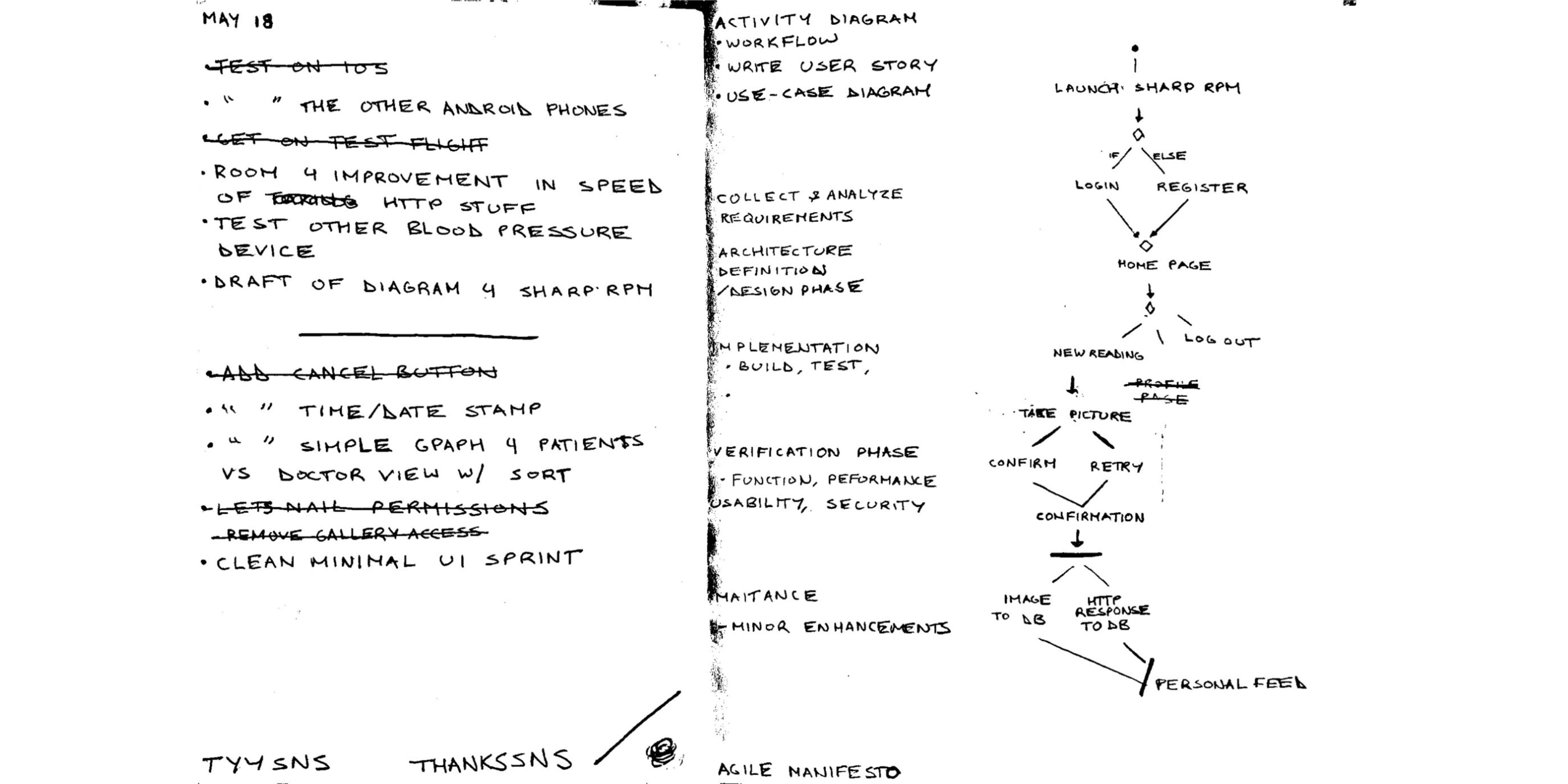
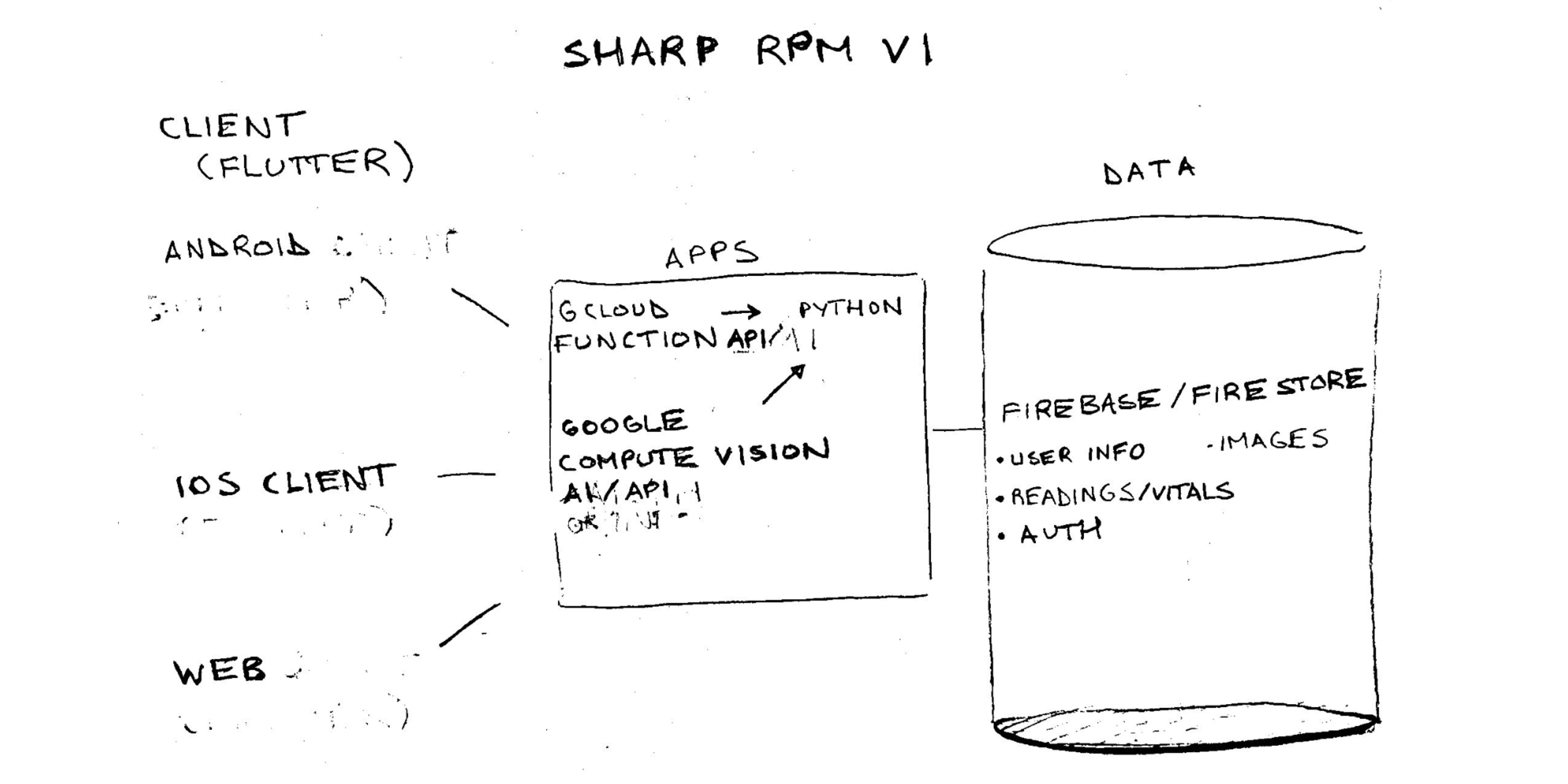
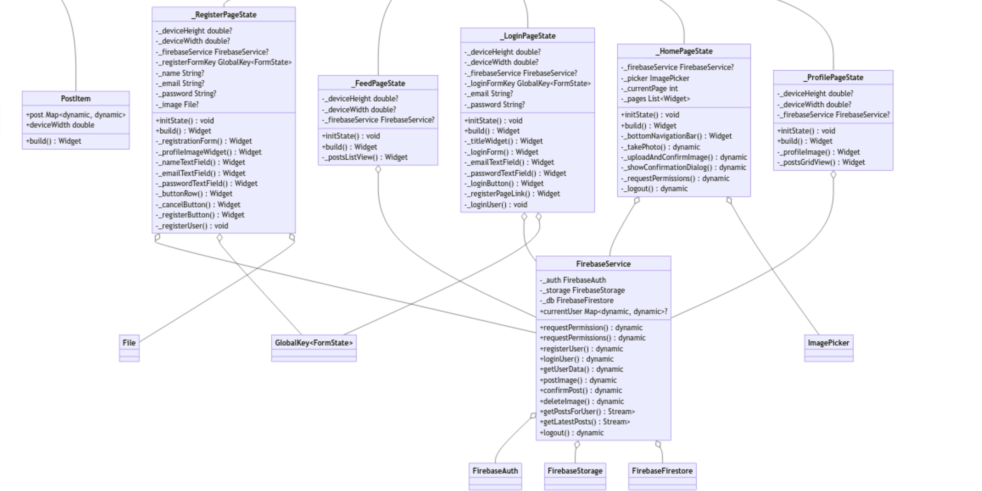
We used the authentication capabilities of Firebase for user authentication and the cloud storage capabilities of Firestore for storing patient vitals and patient information. Below is an initial sketch and the UML for Sharp RPM v1:


Version One
To achieve our objectives, I initiated a series of code experiments and platform tests. Engaging in conversations with physicians, stakeholders, and exploring current medical device applications that communicate via Bluetooth, I developed several concepts. These efforts helped refine our application’s functionality and guided us toward the most effective platform for implementation after extensive testing across multiple options including Azure Computer Vision Service and Python OpenCV.
Google Cloud Vision for the Win !
We concluded with using the Google Computer Vision API, integrating it into a Python script. This script is hosted via Google Cloud Functions, a serverless execution environment, allowing it to be utilized by our multi-platform Flutter application.

Online Presence
Concluding our first sprint of efforts, here’s [Sharp RPM]! You’ll notice that the design decisions of the marketing site were informed by the design system of the application. Stay tuned for our upcoming release of Version 2, encapsulating concepts of Smarview MD & Sharp RPM.